
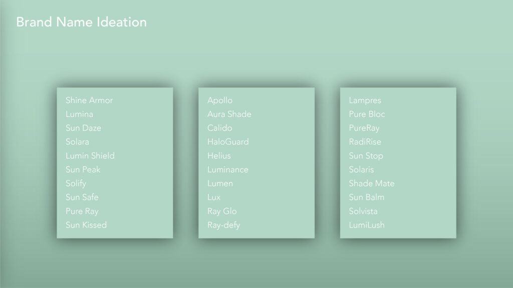
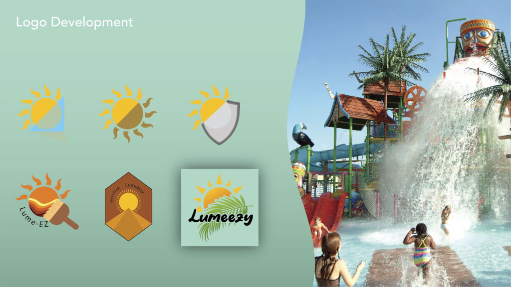
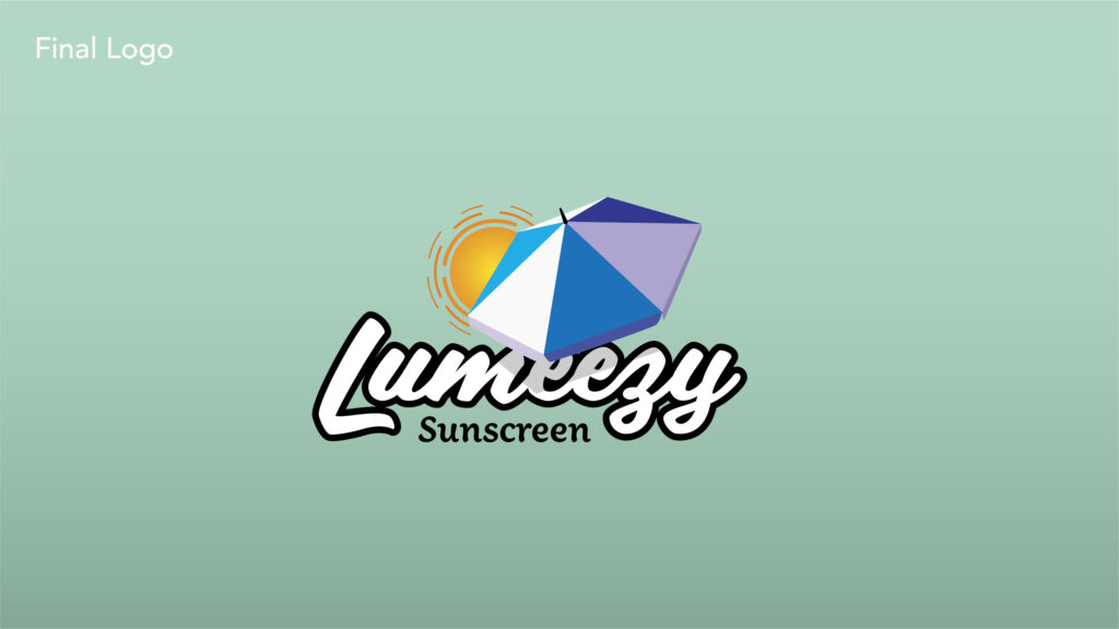
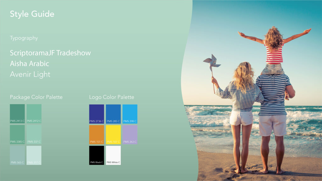
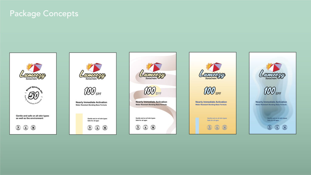
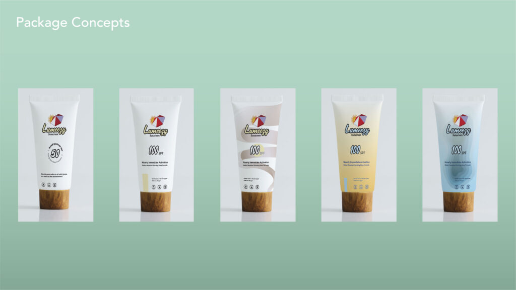
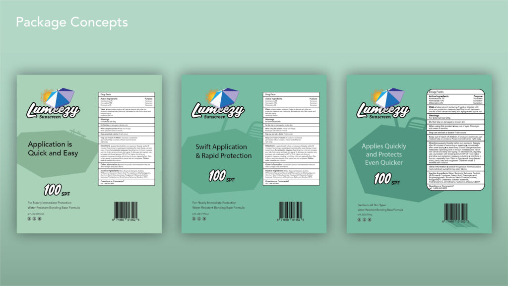
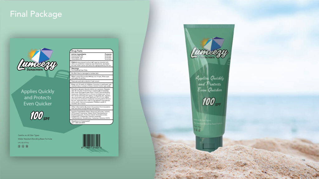
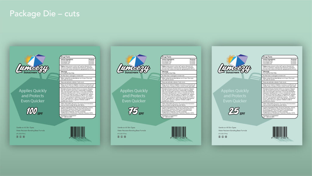
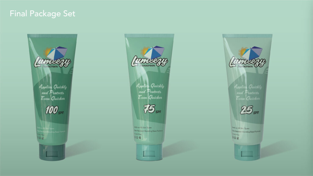
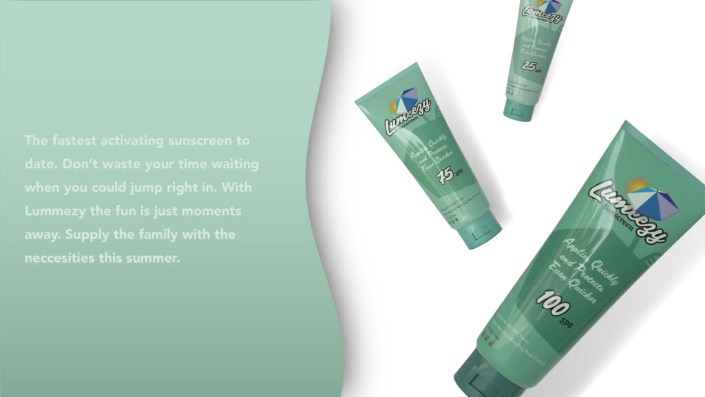
This has been one of my favorite projects thus far. There are so many little things that went into the the branding of this company that will probably go over most people’s heads. So… I am going to explain it here so I know my reasonings are at least out there. Being that the brand is for sunscreen my first task was to find a name that communicated the product and its standout feature. I really liked the word “luminous” and the quick acting aspect of my product means it’s easy to use. Therefore, I came up with Lumeezy. The next thing I had to do was create a logo that communicated the use of the product and the tone I wanted my company to communicate. I landed on a fun script type for the name, and a large simple umbrella blocking out the sun and casting a small shadow on the name; communicating that the product blocks out the sun and is a presents a safe, fun tone. The packaging is where my favorite things come in to play. I wanted to highlight the tagline and spf on the bottles, so I cast a shadow from the umbrella in the logo, on to the rest of the package. Additionally I had the barcode cast a shadow of its own in order the keep the concept continuous. Finally, the packages darken in color as the spf strength increases, as to communicated how much of the sun the product will be blocking out.

